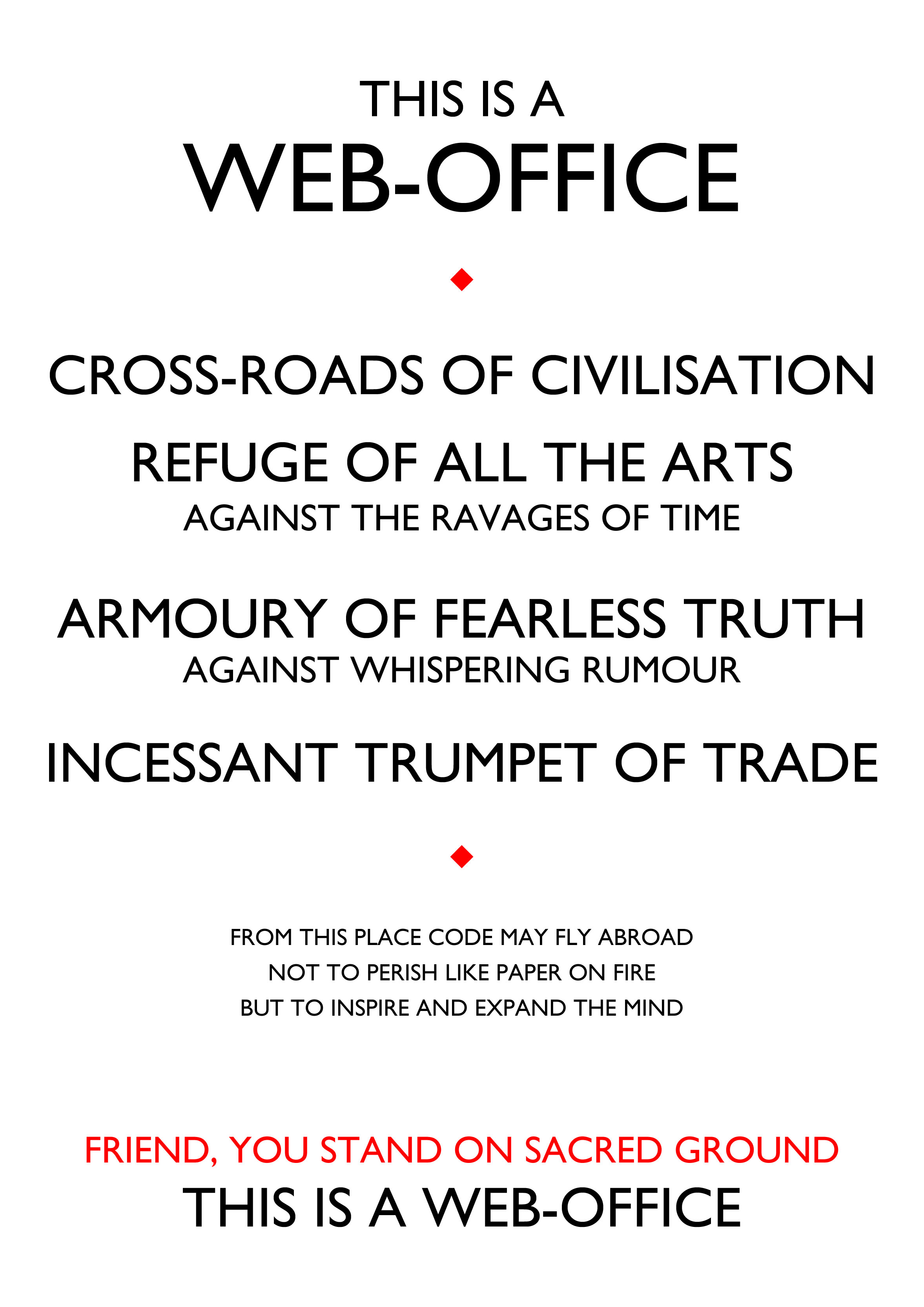
I recently saw in the book “Just My Type” by Simon Garfield a poster by Beatrice Warde, the famous American born typographer who spent much of her career in the UK*. There seem to be many variations of typesetting for the poster, so I’ve no idea if she designed one herself or if it was simply something that printers liked to produce.
But I quite liked the idea of a strong message to visitors of a print shop that what went on there was important. So why not the same for an office of web developers and designers? What we do carries great potential, it is world changing, and we facilitate amazing things. Why shouldn’t we as an industry have something similar to help trumpet our cause? And where better to start than a classic set of words by an eminent typographer?
I’ve set this in Gill Sans Std rather than Albertus of the original I saw, but perhaps there’s a better typeface?
I’m not happy with this quick draft just yet, but wanted to put the idea out to see if it would fly. Comments please!
* Enough, in fact, that I believed she was British until the helpful comment below informed me otherwise.
Stumbled on your comments about Beatrice Warde. Firstly she was American and the type face she used originally was Perpetua and it might help your poster.
You’re right! You’re quite right. I was fooled, I guess, because I knew she’d spent much of her working life in England. I’ll correct the piece now.
With respect to the type used – I’ve seen a few variations. The old one I first saw was Albertus (very popular in the City of London) but it’s not one I especially like as a Northerner. Gill Sans, although also popular in London, doesn’t carry the same connotations of heavy finance and banking.
The original typeface was Perpetua Titling (all caps) designed by Eric Gill and derived from stonecut lettering. Beatrice Warde was not a typographer but a publicist and writer about type. She was American but lived in the UK, working for Monotype Corporation. This was written before Albertus was completed (by Berthold Wolpe) in 1940. Albertus happens to be used for street signs in the City of London, and also (for example) the National Trust all over England – not much to do with the south.
I like the idea of your poster, but a poster is idiomatic to printing, not the web. What is beautiful and moving about the original poster is that it is a medium talking truthfully and modestly about itself. If your facts (and the facts on the web generally) were more true, this poster would be more true of websites. Unfortunately it is a farrago of errors, and therefore – while I sincerely wish you well in this medium – you have in every way missed the point.
Hi David – good points and thanks for the extra information.
I don’t think though that the poster as a form is only for print medium. Our office here has plenty of posters, some typographic in nature. They relate to more than just printing.
As for stating that the quick and dirty poster idea I knocked up is a farrago of errors is to miss the point, entirely, of what I was doing and fails to endear yourself to me. You are clearly very good at typesetting, judging by your work, but that doesn’t mean you need to tackle somebody else’s musings with such stern approbrium.
Sorry, you’re right – I do sound very bad-tempered. Thank you for your insights.