Maps have always fascinated me – I can stand staring at them for hours. Or at least, minutes. Whether it’s a small map of the area, or something covering the whole globe. There’s a few in particular that stand out as interesting, partly for their political background, and others for their technical approach. The first two, the Peters Projection, and the Mercator Equal-Area Projection, are attempts to illustrate the real area of the world’s land masses, and the last one is Google Earth, which provides a dynamic way to view the planet, including the facility to zoom into locations with satellite and aerial imagery.
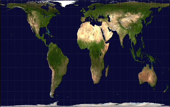
Gall Peters Projection
The Gall-Peters Projection (often known just as the Peters Projection) of the map of the world, also known as a cylindrical projection, is one that’s become popular with many socially aware groups. Mainly because it helps to reassert that the world’s poorer countries take up rather more of our land mass than many people realise.
Although the distortions are a little odd, especially east-west as you near the poles, the map does help to provide a truer picture of the size of many countries than most flat projections.
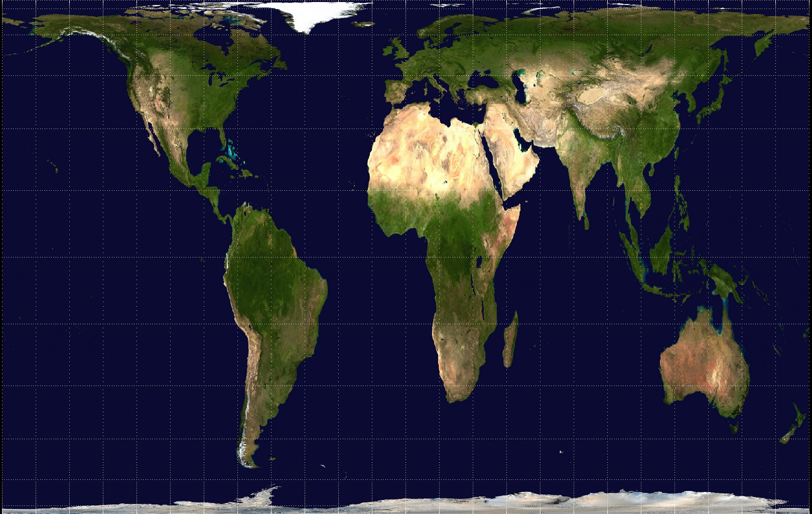
Mercator Real-Area Map
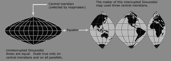
The better real area map, at least for taking measurements from, is the sinusoidal projection (shown below), but that’s harder to look at. In reality, no projection of a globe onto a flat surface can be perfect.
Google Earth
Now Google is a big commercial company – powerful on the internet, and sometimes not that wonderful, but generally they’ve so far been a force for good. And one of my absolute favourites of theirs is the Google Earth application. I’ve spent many a happy hour zooming into countries and cities, checking out locations, and enjoying the ability to see some of the world’s sights from my computer. It’s an incredible application and I can recommend it to anyone. You can download it from http://earth.google.com/ and it works great on most reasonable computers.
Alternatively a globe makes a great piece of interior decor and doesn’t break when the internet goes down….
Credits: Peters-Projection care of NASA/Wikipedia and is in the public domain and can be used by anyone. Sinusoidal Projection care of Wikipedia and is a creative commons licensed image. Please visit the Wikipedia site for more information.
If satellite images are true (not distorted) why do the vast majority still show the content of Africa being represented in the Mercator projection which as you know is the cylindrical map projection presented by the Flemish geographer and cartographer Gerardus Mercator in 1569? If the satellite images are correct, then Africa should be represented as is, which is much bigger than the United States, since the U.S. could fit inside the continent of Africa along with a number of other countries, as a matter of fact the entire Eastern and Western Europe, India, China, etc.